

The Weekly Beat: 12 September 2022
Badly Mangled Bodies, Cheap Oil, Expensive Stocks

Thank you to everyone who has taken the time to hit the like button, comment, or subscribed. If you enjoy this note, please take a moment to like, comment, and subscribe as each of those actions puts a little “gas” in the tank here at Intertemporal Economics. Just clicking like is immensely helpful and is an important source of emotional compensation for writing these notes.
· The badly mangled yield curve got even more twisted as expectations for further rate hikes strengthened, causing the 6-12-month portion of the curve to bulge even higher. The mismatch between the two portions of the yield curve continues to grow (Chart 1).
· The result of recent monetary policy is that the signals sent by the yield curve are distorted. Perhaps most distorted is the 2-10 spread which remains negative and has historically been a reliable leading indicator of recessions. However, the less-watched 5-30 spread remains doggedly positive (Chart 2).
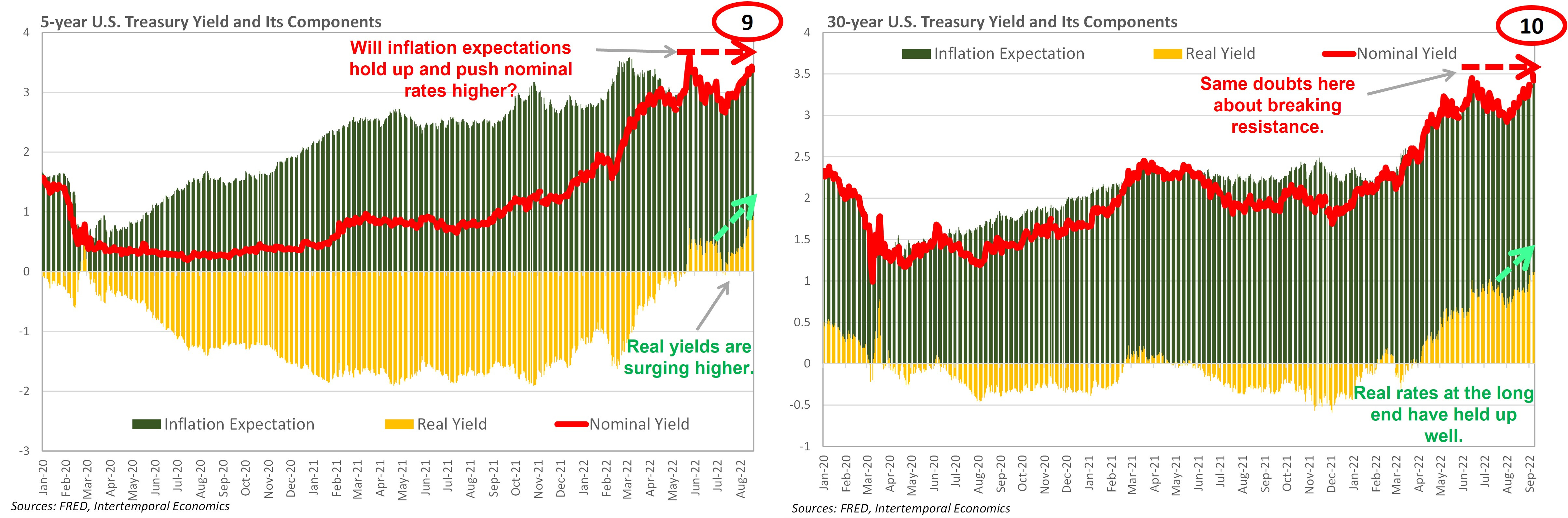
· A 75 or even 100 bps hike seems likely in September, but the FOMC could soon find itself running out of room to tighten. The 5-year rate has been moving higher in step with short-term rates since early August (Chart 3). That created room for the expected rate increases, but that safety valve may soon no longer be available. The 5-year ran out of room when it reached the 30-year rate in April of this year (Chart 4). Since then, the two rates have moved in lockstep, likely guided by the Fed’s trading desk. The 5-yr can only go where the 30-yr leads.
· The entire back half of the curve needs to rise for further tightening to occur without triggering a recession. Expectations for a large rate hike in September are being priced in, but after that there is little room for short-term rates to rise before running into long-term rates (Chart 5). The Fed has been lucky so far in that the spread has remained positive along the length of the yield curve, despite portions of the curve being inverted (Chart 6).
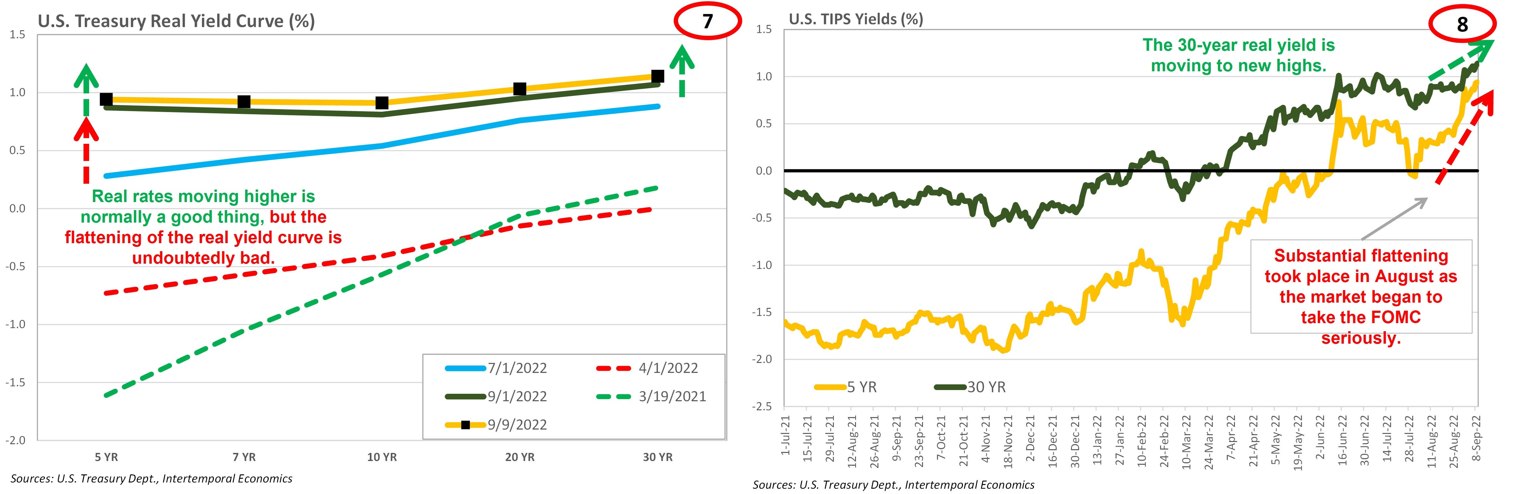
· Of course, from an economic standpoint the rates that matter most are real rates. Here too flattening is sending ominous signals that have yet to manifest into a full-fledged recession (Chart 7). The trigger for the rise in the 5-year real rate appears to have been the tenor of conversation at the Jackson Hole conference. As with nominal rates, the 5-year rose rapidly until running right into the 30-year and stalling (Chart 8).
· Real rates have been moving higher and are now convincingly out of negative territory. Normally this would be a good thing, but higher real rates have come at the cost of lower inflation expectations rather than higher nominal rates (Charts 9 & 10). If markets expect reducing inflation will require much higher real rates the Fed will be in a race against inflation expectations.
· The prize is the direction of real rates, which undoubtedly must move higher for the economy to get back intertemporal balance. However, it is unclear if asset markets, and the expectations of economic agents can withstand higher real rates without a financial crisis occurring.


Commodities Corner
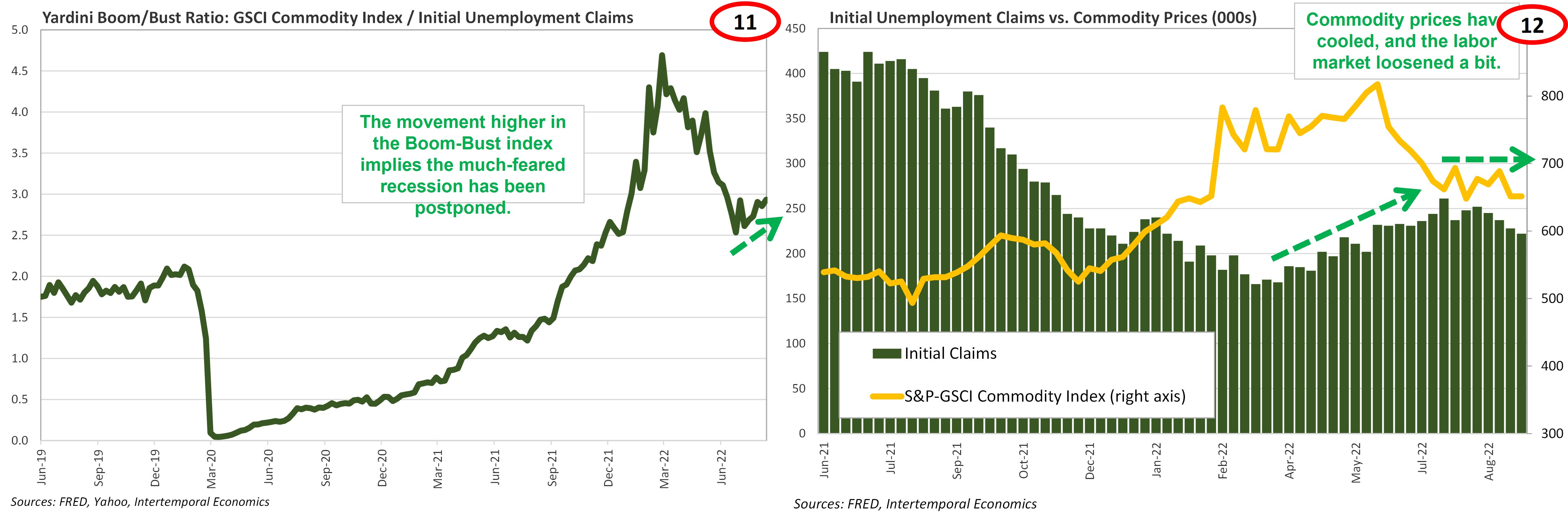
· U.S. labor markets and global commodity prices have experienced some much-needed loosening since early summer. The number of newly unemployed workers rose slightly and commodity prices, particularly oil, eased back but did not collapse. The result has been optimistic signs coming from the Boom-Bust index, which is showing elevated economic activity, but not an unsustainable boom (Charts 11-12).
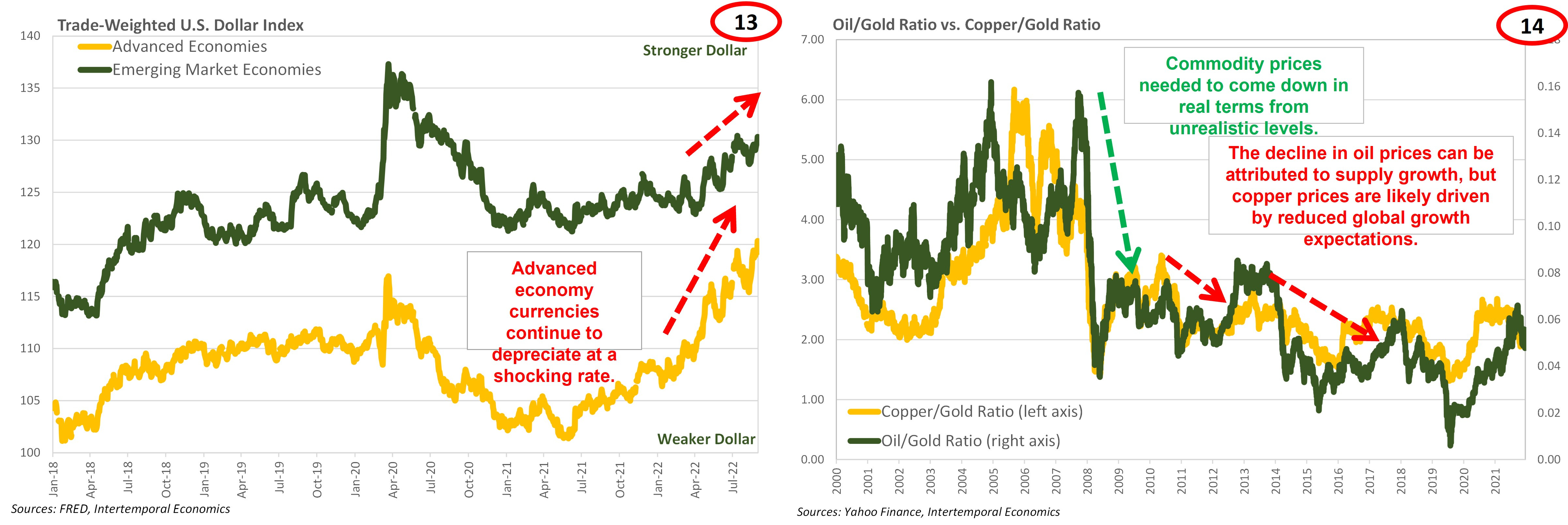
· For now, dollar indices continue to trade stronger (Chart 13). However, an easing of concerns about runaway inflation entangling the U.S. economy will likely ease the pressure on non-U.S. currencies. Advanced economy currencies, which have been weakening as markets do not expect the ECB or BoJ can match the Fed’s forcefulness in tightening policy. The less inflationary pressure there is in the U.S. the less tight the Fed can set monetary policy in the U.S., which plays a major role in monetary conditions globally.
· The stronger dollar has no doubt played a role in keeping a cap on commodity prices in the U.S. but there are some concerning trends in the real prices for oil and copper (Chart 14). Steady expansion of tight oil as a percentage of total U.S. oil production can explain the decline in real oil prices. Harder to justify is the slow-but-steady decline in the real price of copper. The trend is worth watching because it will give insight into market expectations for global growth.
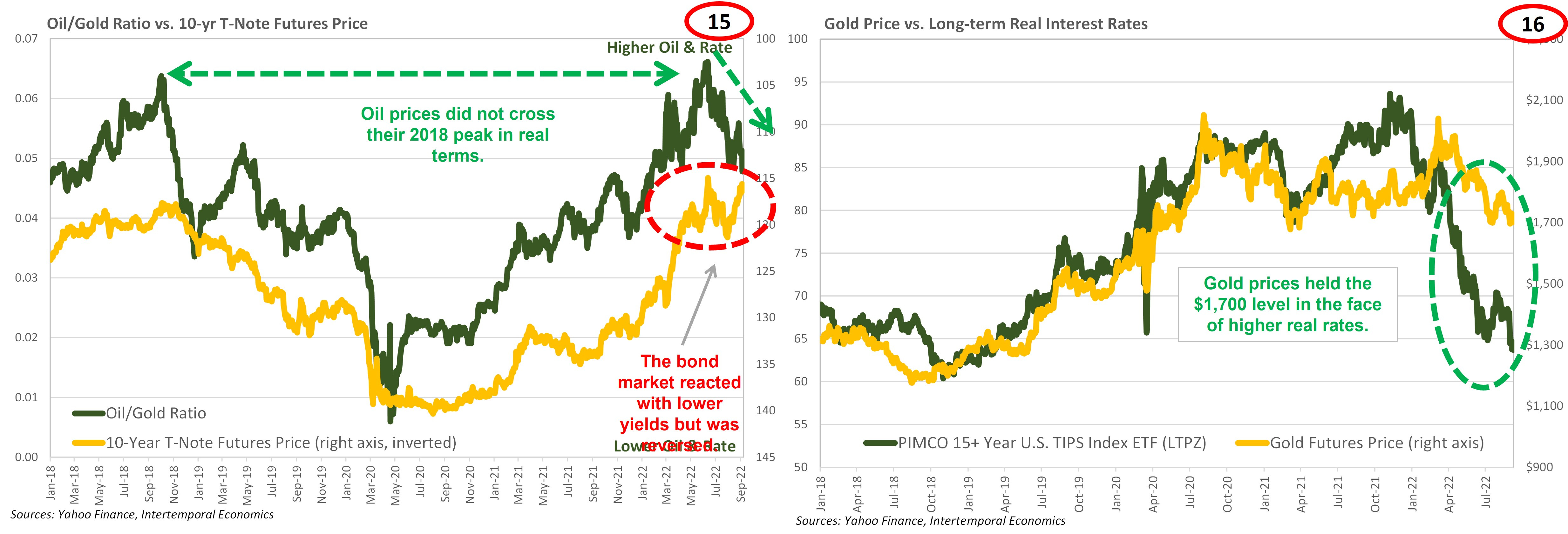
· The price of oil is coming down in nominal and real terms (Chart 15). However, it is unclear whether oil plays the same role in setting inflation expectations that it once did. Nominal 10-year rates historically moved in conjunction with the real price of oil. That could still be the case going forward, but the recent divergence of the two is notable.
· Another reliable relationship that has broken down recently is the one between long-term real interest rates and gold (Chart 16). Normally these two measures move closely together, but recently gold has held up very bullishly in the face of rising real rates. Presumably the gold market is expecting real rates to come down, but it is unclear whether the expectation is for inflation to rise or nominal rates to fall.
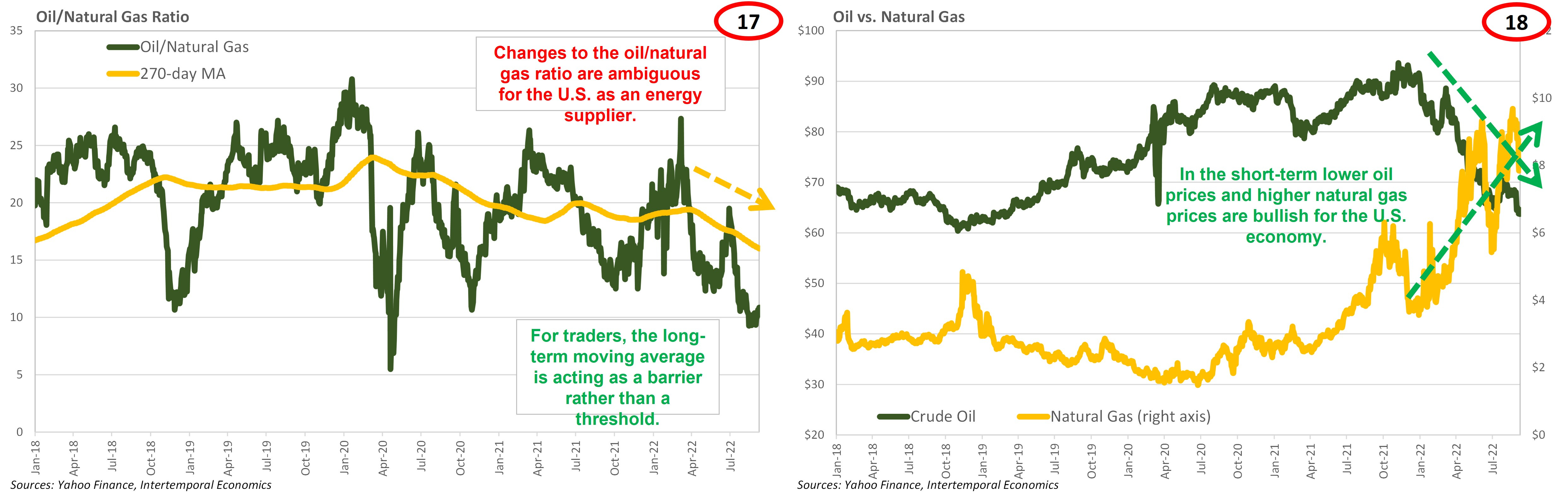
· The relationship between the price of oil and the price of natural gas may also be in the process of changing. Historically, for lack of a liquid market, the price of natural gas was set using the price of oil as a benchmark. As natural gas has become a globally traded commodity the prices of the two have steadily disconnected. Indeed, the prices are headed in opposite directions and the ratio is clearly trending towards higher natural gas prices relative to the price of oil (Charts 17 & 18).
Equity Markets
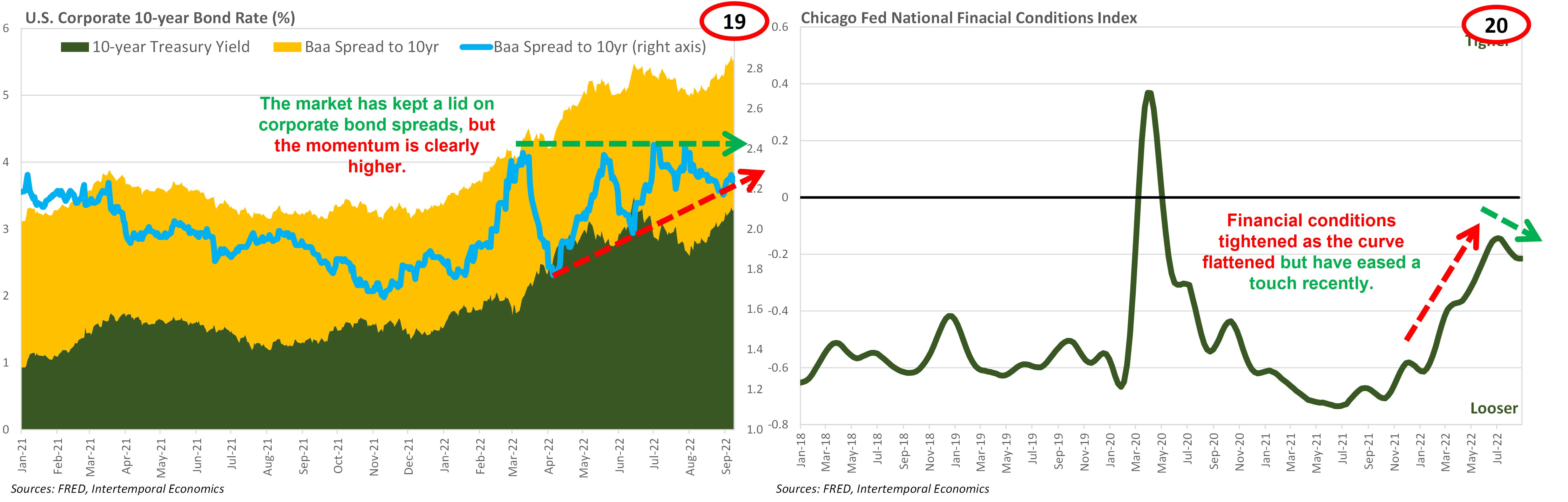
· Corporate credit spreads have not risen significantly, but there is a clear triangle with an upwards sloping bottom, indicating a possible breakout to the upside (Chart 19). Financial conditions tightened significantly from late 2021 to July 2022 as the yield curve flattened but have eased slightly since the start of August (Chart 20). That easing has likely contributed to the short-term uptrend in equity prices.
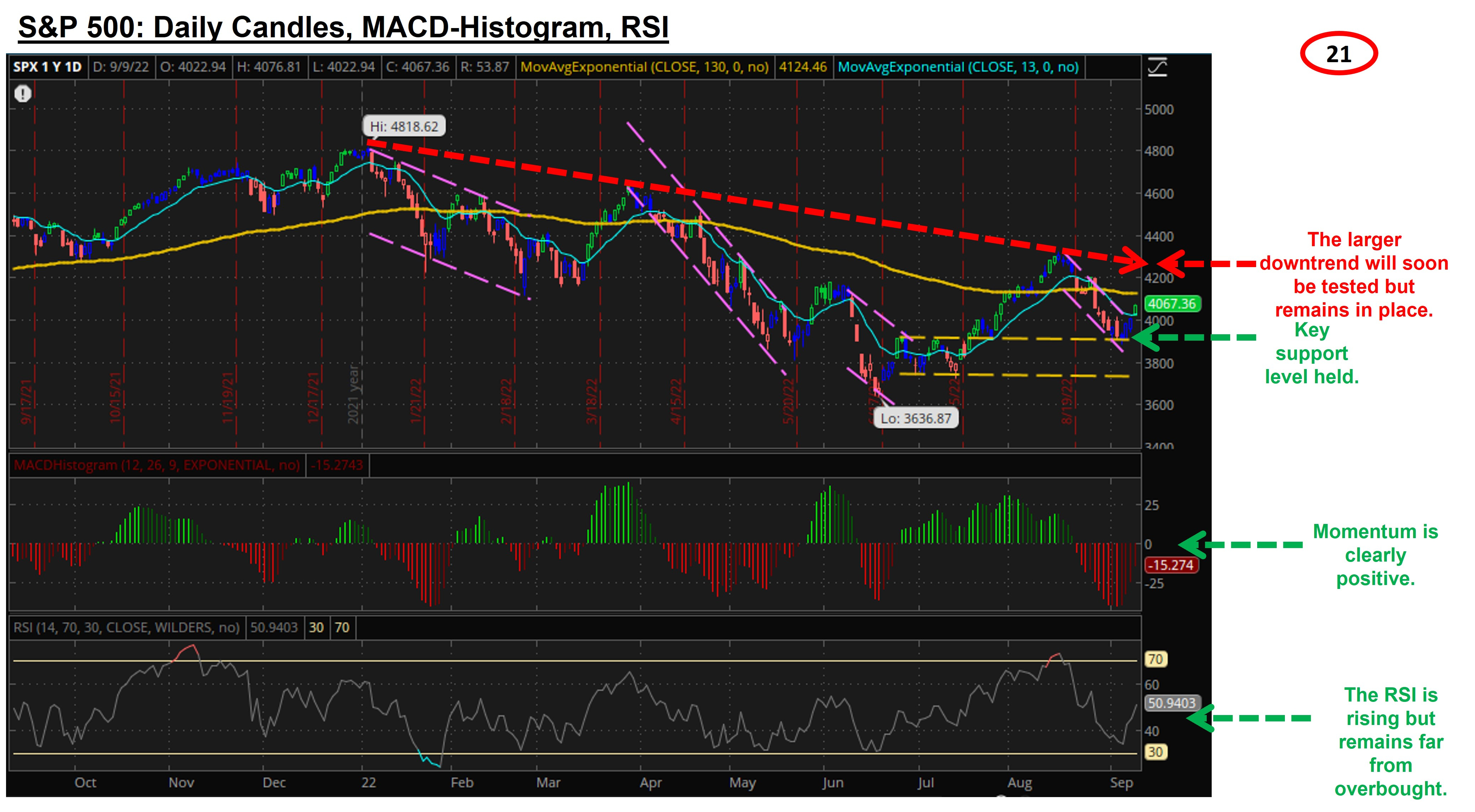
· A key support level for the S&P 500 held last week, sending a short-term buy signal as a result (Chart 21). Signals from momentum are positive and the RSI is a long way from overbought. Those factors align for short-term upside for the index. However, the larger downtrend remains in-place and will come into question at an index level of around 4200.
· The sectors of winners and losers is a jumbled mix that is indicative of how disjointed the market is (Chart 22). Consumer discretionary has been making a comeback as fears of recession have faded. At the same time, the highly defensive utilities sector is among the top performers. Among the losers are sectors that would benefit most from fiscal stimulus and/or the avoidance of recession.
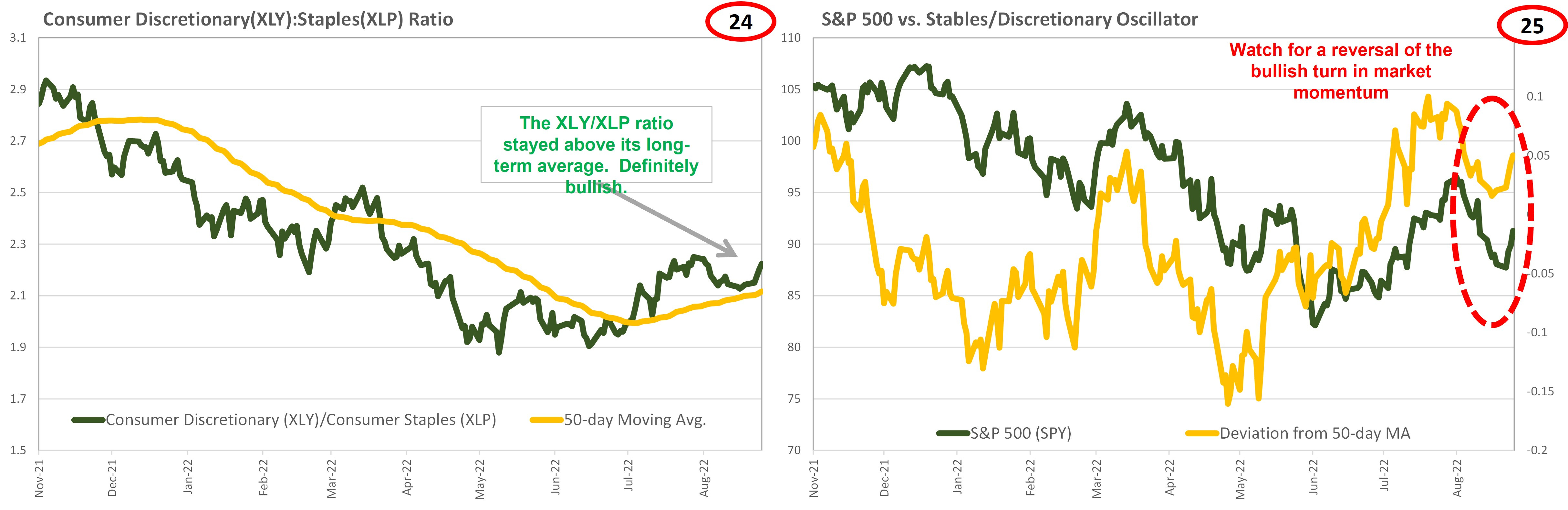
· Small cap and tech stocks continue to underperform the large cap stocks in the S&P 500 (Chart 23). We do not expect the downtrend in equities to end until the stocks being pressured by the current scarcity of capital are outperforming. Short-term bullish signals are being sent by the relationship between consumer staples and consumer discretionary sectors (Charts 24-25).